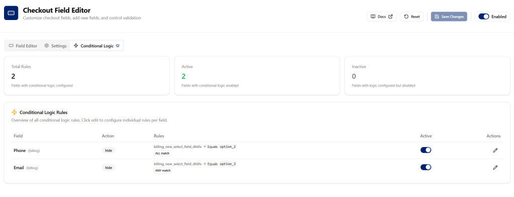
The Checkout Field Editor is a powerful tool that allows you to fully customize your WooCommerce checkout form. Add, remove, reorder, and modify fields to create a streamlined checkout experience tailored to your business needs.
Overview #
What is the Checkout Field Editor?
The Checkout Field Editor gives you complete control over the checkout fields displayed to your customers. You can:
- Add new fields to collect additional information (delivery instructions, gift messages, custom data)
- Edit existing fields – change labels, placeholders, and validation rules
- Reorder fields using intuitive drag-and-drop
- Hide or disable fields you don’t need
- Organize fields into sections – Billing, Shipping, Additional Information, and Order Notes
Getting Started
- Navigate to Swift Commerce → Checkout → Field Editor in your WordPress admin
- Toggle Enable Field Editor to activate the feature
- Use the Editor tab to manage fields visually
- Use the Settings tab to configure global options
- Click Save Changes when done
Editor Tab #
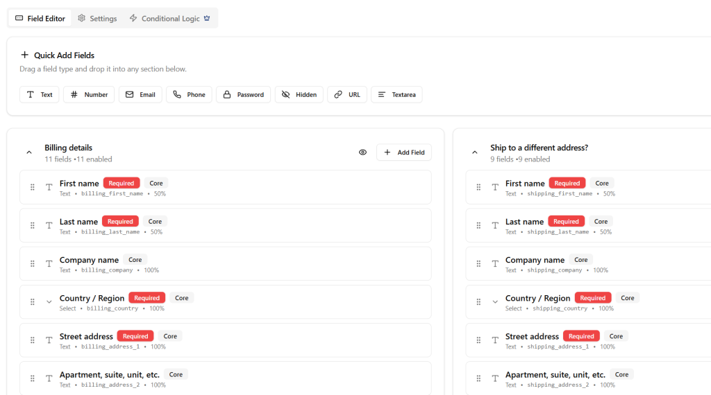
The Editor tab is your visual workspace for managing all checkout fields. It displays fields organized by section with full drag-and-drop support.
Quick Add Fields
Add new fields instantly using the Quick Add toolbar at the top of the editor.
| Field Type | Description | Availability |
|---|---|---|
| Text | Single-line text input | Free |
| Number | Numeric input with validation | Free |
| Email address with format validation | Free | |
| Phone | Telephone number input | Free |
| Password | Password input (masked) | Free |
| Hidden | Hidden field (not visible to customers) | Free |
| URL | Website URL input | Free |
| Textarea | Multi-line text area | Free |
Pro Field Types (requires Swift Commerce Pro):
| Field Type | Description |
|---|---|
| Select | Dropdown menu with options |
| Multi Select | Select multiple options |
| Radio | Radio button group |
| Checkbox | Single checkbox toggle |
| Checkbox Group | Multiple checkboxes |
| File Upload | Allow customers to upload files |
| Date | Date input field |
| Time | Time input field |
| Date & Time | Combined date and time picker |
| Month | Month selection |
| Week | Week selection |
| Date Picker | Advanced calendar picker |
| Time Picker | Advanced time picker |
| Heading | Section heading (display only) |
| Label | Static label text |
| Paragraph | Descriptive paragraph text |
Checkout Sections
Fields are organized into four sections:
| Section | Description | Default Fields |
|---|---|---|
| Billing | Customer billing address and contact info | First Name, Last Name, Company, Country, Address, City, State, Postcode, Phone, Email |
| Shipping | Shipping destination address | First Name, Last Name, Company, Country, Address, City, State, Postcode |
| Additional Information | Custom fields for extra data collection | Empty by default |
| Order Notes | Customer notes about their order | Order Comments |
Section Controls
Each section card provides:
- Expand/Collapse – Toggle section visibility in the editor
- Enable/Disable – Hide entire sections from checkout
- Field Count – Shows total and enabled field counts
- Add Field – Button to add new fields to the section
Managing Individual Fields
Field Card Display
Each field shows:
- Icon – Visual indicator of field type
- Label – The field’s display name
- Required Badge – Red badge if field is required
- Core Badge – Gray badge for WooCommerce default fields
- Field Type – Text, Email, Select, etc.
- Field Key – The unique identifier (e.g.,
billing_email) - Width – 100%, 50%, or 33%
Field Actions
Hover over any field to reveal action buttons:
| Action | Icon | Description |
|---|---|---|
| Enable/Disable | Eye/EyeOff | Toggle field visibility on checkout |
| Edit | Pencil | Open detailed field editor dialog |
| Duplicate | Copy | Create a copy of the field |
| Delete | Trash | Remove the field (custom fields only) |
Note: Core WooCommerce fields cannot be deleted, but they can be hidden. Hiding core fields requires Swift Commerce Pro.
Drag and Drop Reordering
Reorder fields within a section by dragging the grip handle on the left side of each field card. Fields will automatically update their priority order when dropped.
Field Editor Dialog
Clicking the Edit button opens a comprehensive dialog with four tabs:
General Tab
| Setting | Description |
|---|---|
| Label | The text displayed above or beside the field |
| Field Key | Unique identifier used in code and database |
| Placeholder | Ghost text shown inside empty fields |
| Description | Help text displayed below the field |
| Default Value | Pre-filled value when checkout loads |
| Width | Full (100%), Half (50%), or Third (33%) |
| CSS Class | Custom class names for styling |
| Field Enabled | Toggle to show/hide this field |
Validation Tab
| Setting | Description |
|---|---|
| Required Field | Make this field mandatory |
| Min Length | Minimum character count (text fields) |
| Max Length | Maximum character count (text fields) |
| Min Value | Minimum number (number fields) |
| Max Value | Maximum number (number fields) |
| Validation Pattern | Predefined or custom regex pattern |
| Error Message | Custom message when validation fails |
Available Validation Patterns:
| Pattern | Description |
|---|---|
| None | No pattern validation |
| Letters only | Alphabetic characters only |
| Numbers only | Numeric characters only |
| Alphanumeric | Letters and numbers |
| Canadian postal code | Format: A1A 1A1 |
| US ZIP code | Format: 12345 or 12345-6789 |
| UK postcode | Standard UK format |
| Custom pattern | Define your own regex |
Options Tab (For Select, Radio, Checkbox Group)
Manage the choices available in selection fields:
- Add Option – Create a new choice
- Label – Display text shown to customers
- Value – Internal value stored in the database
- Set as Default – Pre-select this option
- Reorder – Drag to change option order
- Delete – Remove an option
Advanced Tab
| Setting | Description |
|---|---|
| Autocomplete | Browser autocomplete attribute (e.g., given-name, email) |
| Rows | Number of rows for textarea fields |
| Allowed File Types | Comma-separated extensions for file uploads |
| Max File Size | Maximum upload size in MB |
| Min/Max Date | Date range limits for date fields |
| Prefix | Text displayed before the input |
| Suffix | Text displayed after the input |
| Input Mask | Format mask (e.g., (999) 999-9999 for phone) |
Input Mask Syntax:
9= Any digit (0-9)- a = Any letter (a-z, A-Z)
*= Any character
Settings Tab #
The Settings tab contains global configuration options that affect all checkout fields.
General Settings
| Setting | Description | Default |
|---|---|---|
| Enable Field Editor | When disabled, WooCommerce default checkout fields are used | Enabled |
| Enable Conditional Logic | Allow fields to show/hide based on other field values | Enabled (Pro) |
| Enable Custom Validation | Allow custom validation patterns for fields | Enabled (Pro) |
Display Settings
Configure how fields appear on the checkout page.
| Setting | Description | Default |
|---|---|---|
| Show Field Labels | Display labels above form fields | Enabled |
| Show Placeholders | Display placeholder text inside fields | Enabled |
| Show Field Descriptions | Display help text below fields | Enabled |
| Required Field Indicator | Character to mark required fields | * |
| Indicator Position | Show indicator before or after the label | After |
Validation Settings
Control how field validation behaves during checkout.
| Setting | Description | Default |
|---|---|---|
| Validate on Blur | Validate fields when user leaves them | Enabled |
| Validate on Submit | Validate all fields when form is submitted | Enabled |
| Show Errors Inline | Display error messages next to fields | Enabled |
| Scroll to First Error | Automatically scroll to the first error | Enabled |
| Highlight Error Fields | Add visual highlight to fields with errors | Enabled |
| Error Position | Display errors above or below the field | Below |
Address Override Settings
Configure how address fields interact with saved customer data.
| Setting | Description | Default |
|---|---|---|
| Override Address Fields | Allow checkout fields to override saved address data | Disabled |
| Allow Billing Override | Users can override their saved billing address | Enabled |
| Allow Shipping Override | Users can override their saved shipping address | Enabled |
| Sync Billing & Shipping | Keep billing and shipping addresses synchronized | Disabled |
File Upload Settings (Pro)
Configure file upload behavior for file fields.
| Setting | Description | Default |
|---|---|---|
| Upload Directory | Subfolder within wp-content/uploads | checkout-uploads |
| Max Total Upload Size | Maximum total file size per checkout (MB) | 10 MB |
Supported file types are configured per-field in the Pro settings:
- Default allowed:
jpg, jpeg, png, pdf, doc, docx
Import, Export & Reset
| Action | Description |
|---|---|
| Export Settings | Download all field configurations as JSON |
| Import Settings | Upload a previously exported JSON file |
| Reset to Defaults | Restore all fields to WooCommerce defaults |
Warning: Reset cannot be undone. Export your settings first if you want to preserve them.
Conditional Logic (Pro) #
Conditional logic allows you to show or hide fields based on the values of other fields.
How It Works
- Edit a field and go to the Conditional Logic section
- Enable conditional logic for the field
- Choose the action: Show or Hide
- Set the logic mode: All rules (AND) or Any rule (OR)
- Add rules based on other field values
Available Operators
| Operator | Description |
|---|---|
| Equals | Field value matches exactly |
| Does not equal | Field value doesn’t match |
| Contains | Field value includes the text |
| Does not contain | Field value excludes the text |
| Is empty | Field has no value |
| Is not empty | Field has a value |
| Greater than | Numeric comparison |
| Less than | Numeric comparison |